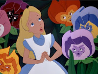
For example with these Alice in Wonderland images by Lewis Caroll.
In this original image i can see that there is a lot of emotion in it. The image looks quite old so you can tell that it is an original. This example differs from the ones created now, The Disney versions in a lot of many ways. The facial expressions on the original version vary from the newer version as they seem angry and the media they have used to create it, the dark lines help to assist the angry theme. Whereas if the designer was trying to create a happy feeling in the picture and they used this dark line work it wouldnt really work.
 This image has been interpreted in a more modern way to fit with the more modern times and so it looks good in a film. For example in this picture to the right.
This imaeg has been changed by making the colours brighter to interested the audience (children) more. As i feel that the original version wouldnt of attracted many people of my time. There are facial expressions present on this image but they are more shocked than angry. The main way this image has been interpreted is through the changes and quality of colour over time. This shown in the image below.
The colours are stronger than the oringial but doesnt look as good as the more modern version.
Testing
All artists test their work and show it to people before its published using blogs and then it goes into galleries. The blog helps the artist to get feeback on their work so they can improve and make it better.
This is an example of a blog which links with the artists i have used in my thrid project.
This is Tim Marrs Blogs and enables the audience to comment on his work.


No comments:
Post a Comment